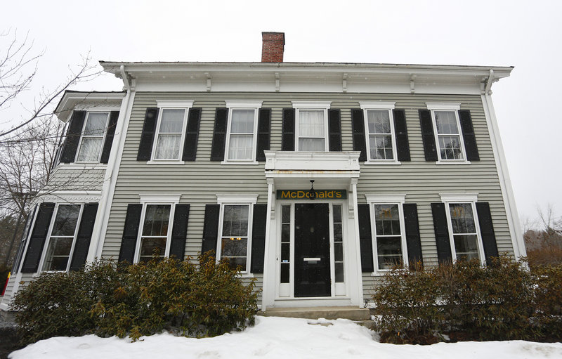
With its gray siding, dark shutters and a handsome white-painted portico, the quaint historic home on Main Street in Freeport screams tasteful, residential New England.
Yet it is also a McDonald’s restaurant, one of the thousands that dot the American landscape. With so many outposts, the restaurants have become an unusual but instructive yardstick for design and development standards that communities are using to instill a sense of place and attract village-style development.
“In most cases, a national franchise will have a prototypical plan or building footprint that they will use unless the community has something it expects, asks, or in some cases, mandates,” said Terry Schwarz, director of the Cleveland Urban Design Collaborative.
Schwarz wrote a 2004 paper on how communities in the United States and Europe have differing abilities to defend regional identity by mandating the removal or modification of franchise architecture. She writes that bucking the franchise mold is tougher in “placeless places” than in historic areas with distinctive architecture or designs, where communities are more likely to rally behind existing buildings.
Indeed, in the early 1980s, when the double-arched beacon of cheap burgers and fries sought a place among the outlet stores in Freeport, design review standards were not yet fully in place, said Ned Allen, collections manager at the Freeport Historical Society.
“McDonald’s actually agreed to follow the design review standards … even though they were not in place then,” Allen said.
Farther down Route 1, it’s easy to see how the McDonald’s architecture template varies.
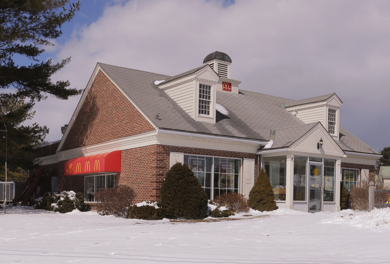
The Yarmouth McDonald’s, clad in red brick with wide windows and white shutters, features a pointed roof and faux-farmhouse gables, cutting a slightly more camouflaged profile in the suburban area.
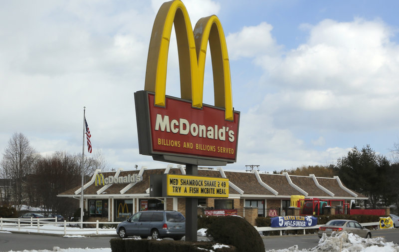
A little farther and it does not take long to find a classic version — this one in Falmouth — with brown shingles, tan brick and the low mansard roof accented by increments of white that would be recognizable even without a bulky lettered sign.
The Falmouth location is nearly identical to one farther south in Scarborough that is set for demolition next month, to be replaced with a new McDonald’s.
The restaurant stands along Route 1 at Oak Hill in a zoning area created to foster the kind of mixed-use, multi-floor development that many Maine communities now envision for their downtown areas. To spur the second-floor designs, the town put in place a 20-foot building height minimum.
Scarborough Town Planner Dan Bacon said the planning board spent time addressing the appearance of the new McDonald’s, swapping designs, tweaking the facade and ultimately having the developer add a row of second-story windows.
“It’s often the franchise restaurants that take the longest times to balance what their template designs call for,” said Bacon. “It’s sometimes an economic development tool to require a certain standard so you continue to attract higher-quality uses.”
Matt Byrne can be contacted at 791-6303 or at:
mbyrne@mainetoday.com
Send questions/comments to the editors.


Comments are no longer available on this story